
Intercom-Onboarding
Breaking down Intercom’s onboarding user flow. Video, screenshots, and Figma files included.
Video
Screenshots
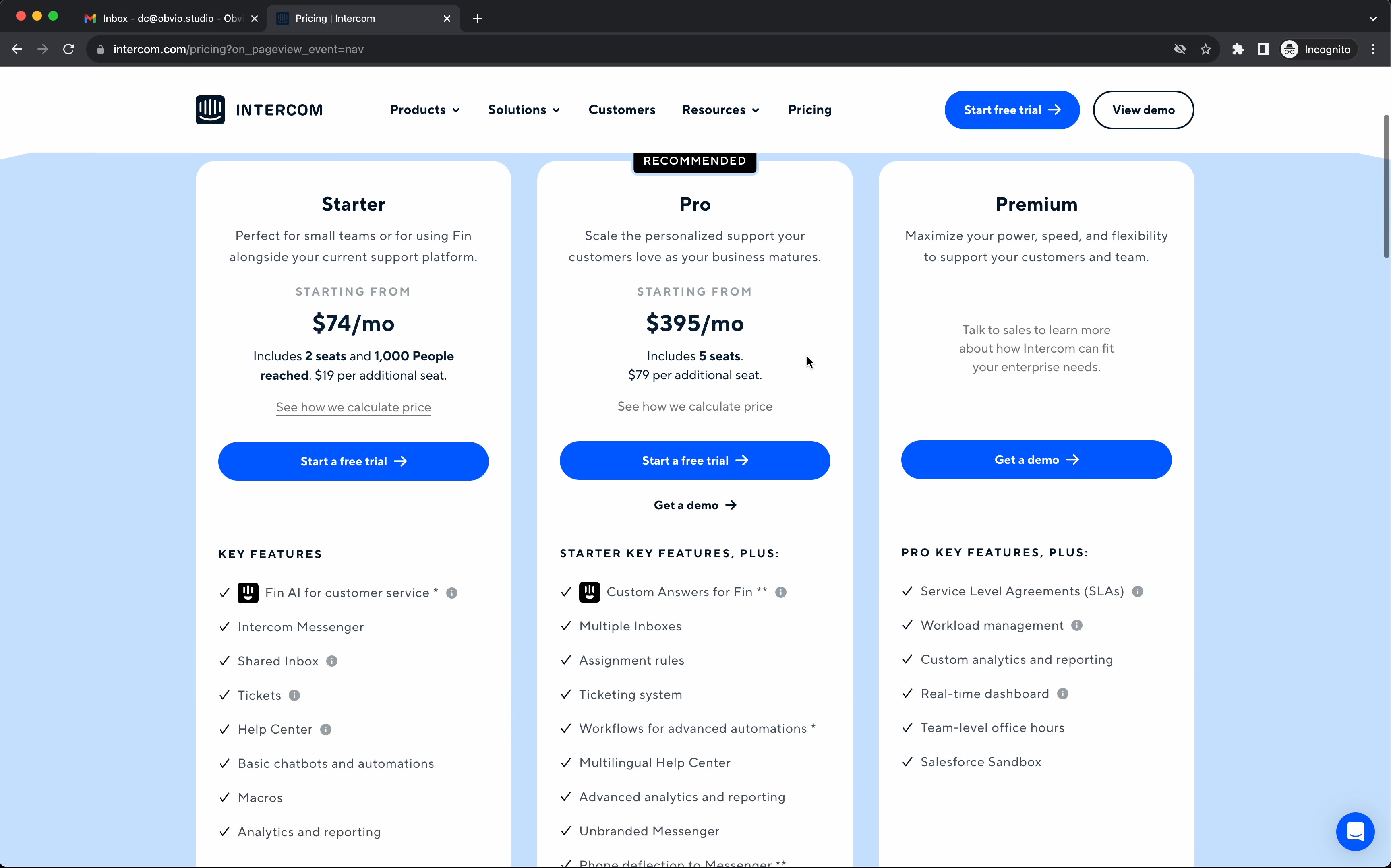
1/ It’s clear what you’re getting extra in Pro and Premium. With just the use of one magic word, “plus.” Starter Key Features, Plus. Pro Key Features, Plus.
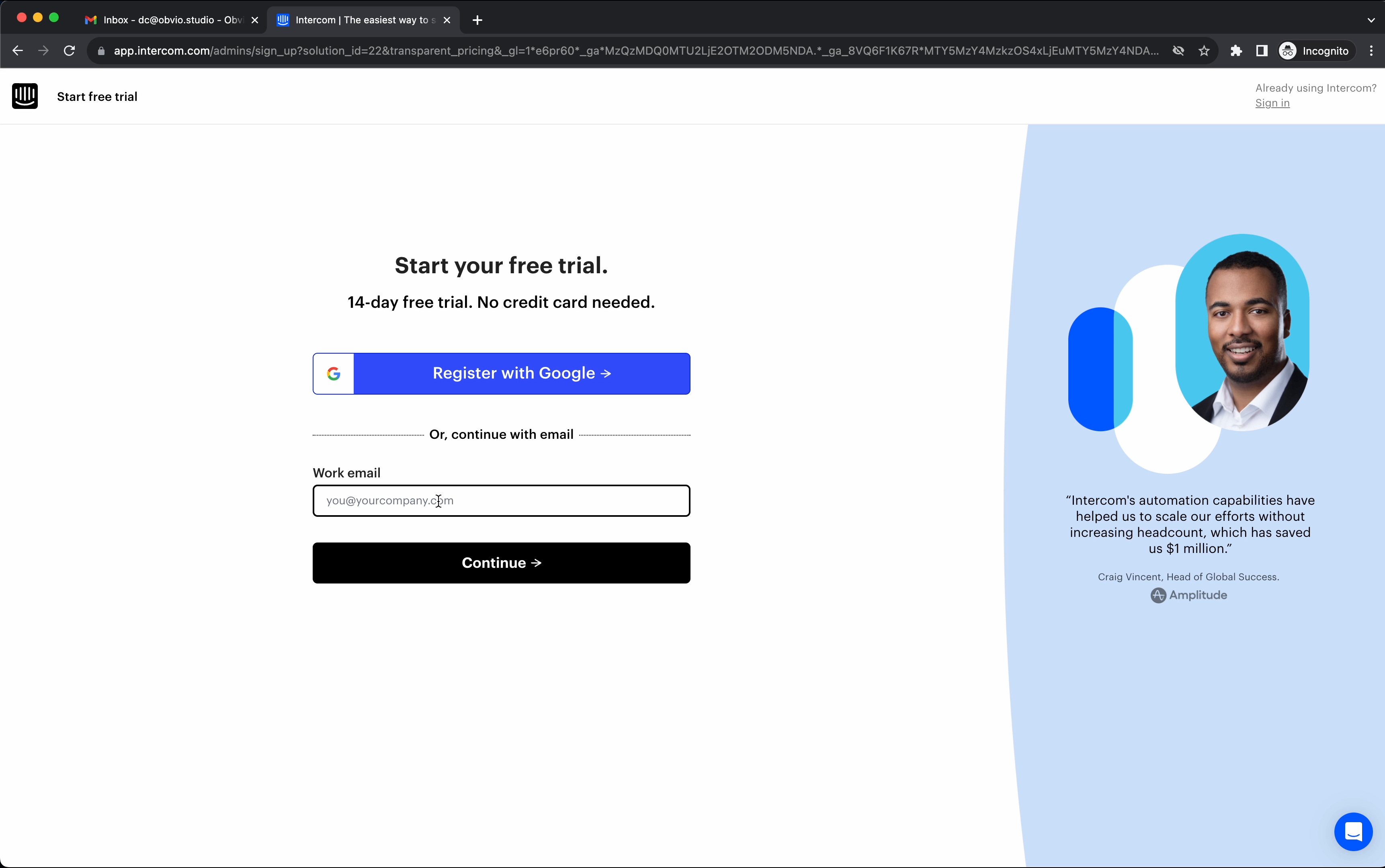
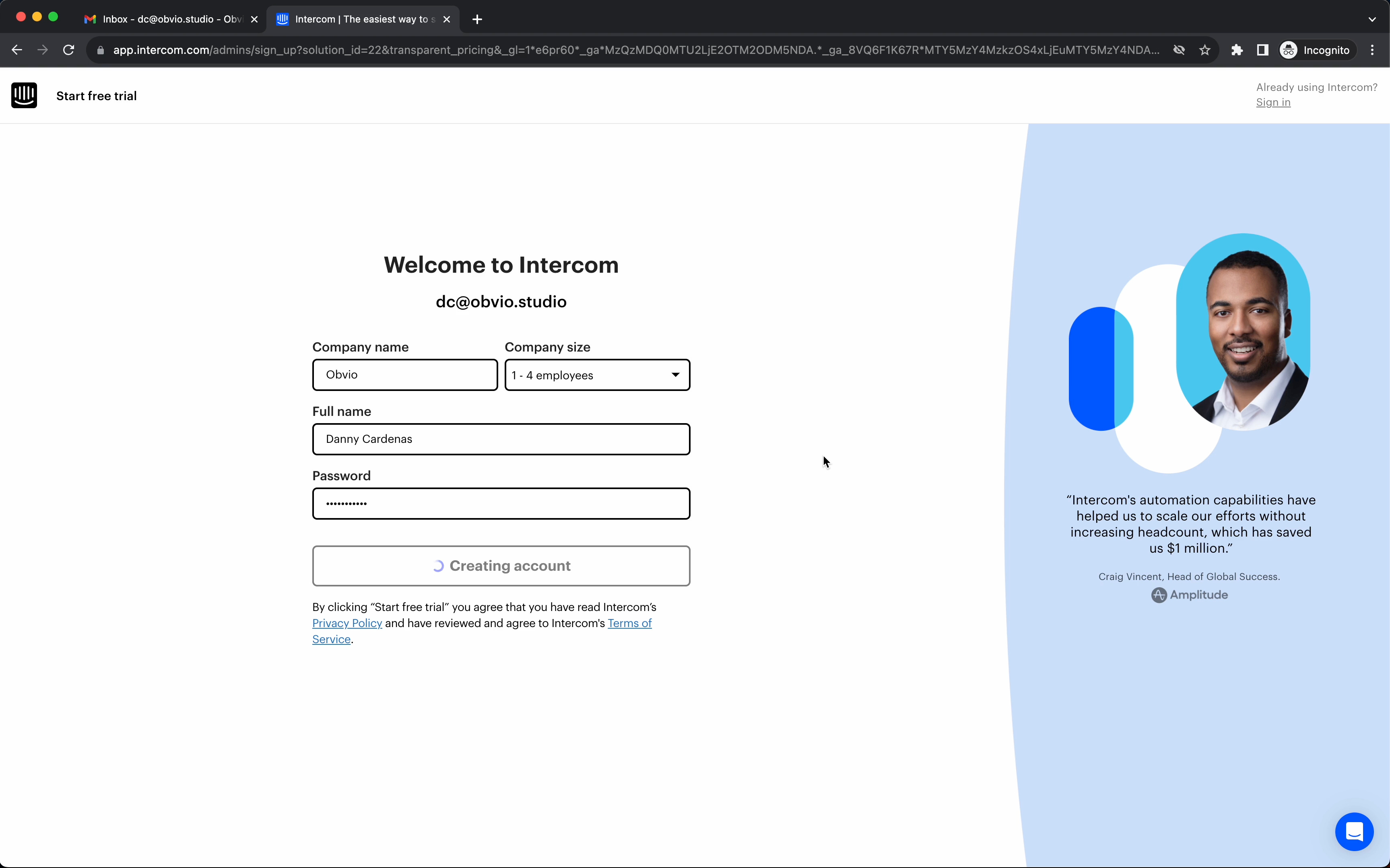
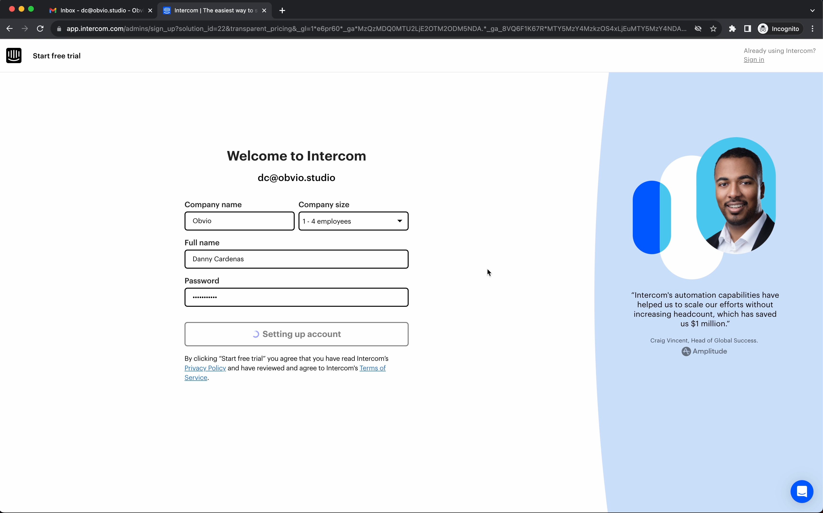
2/ A simple and straight forward sign-up page. Sign in with gmail or continue with a work email.
One thing I wasn’t too stoked about was the fact that email automatically errors out before I finish typing it in.
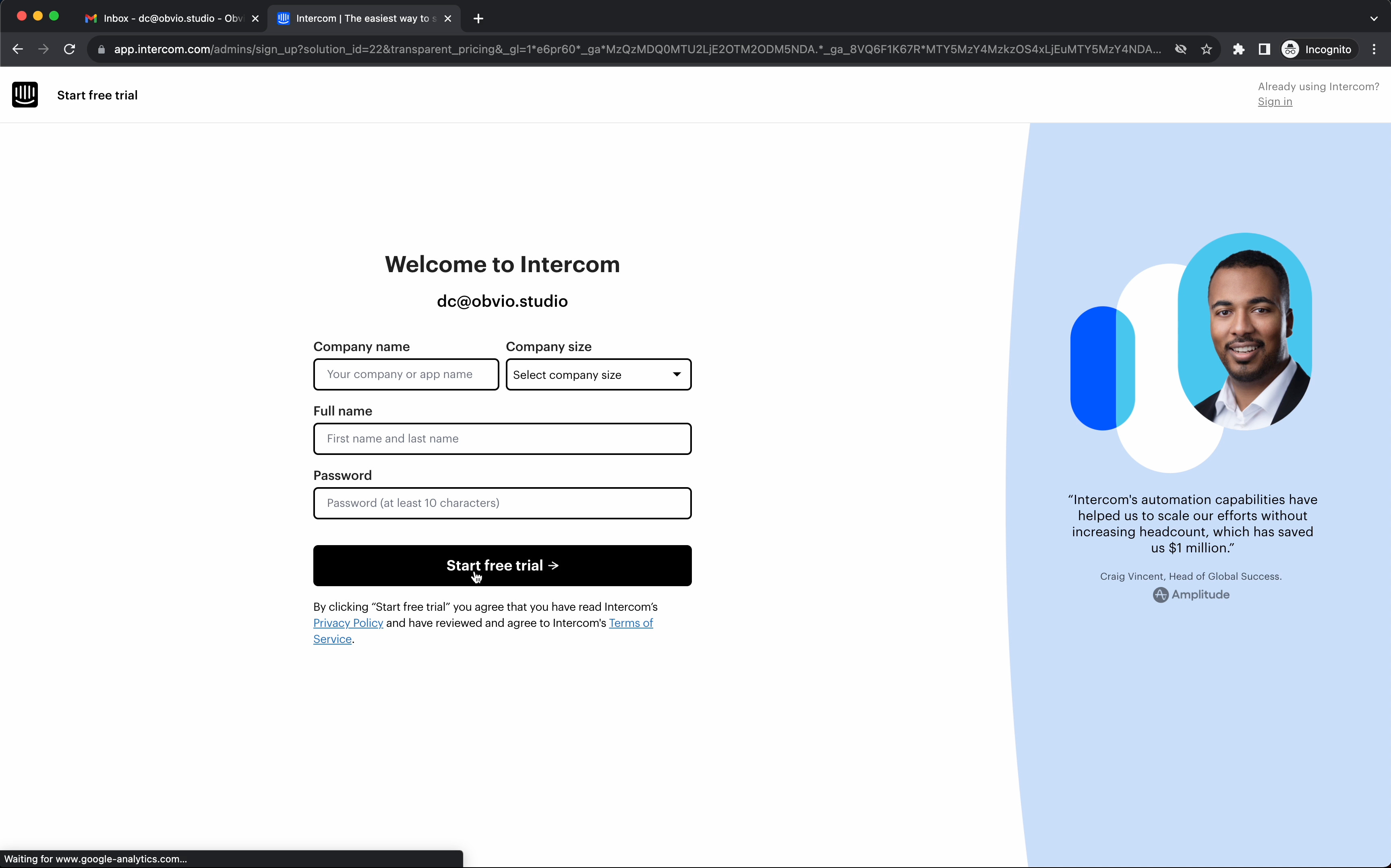
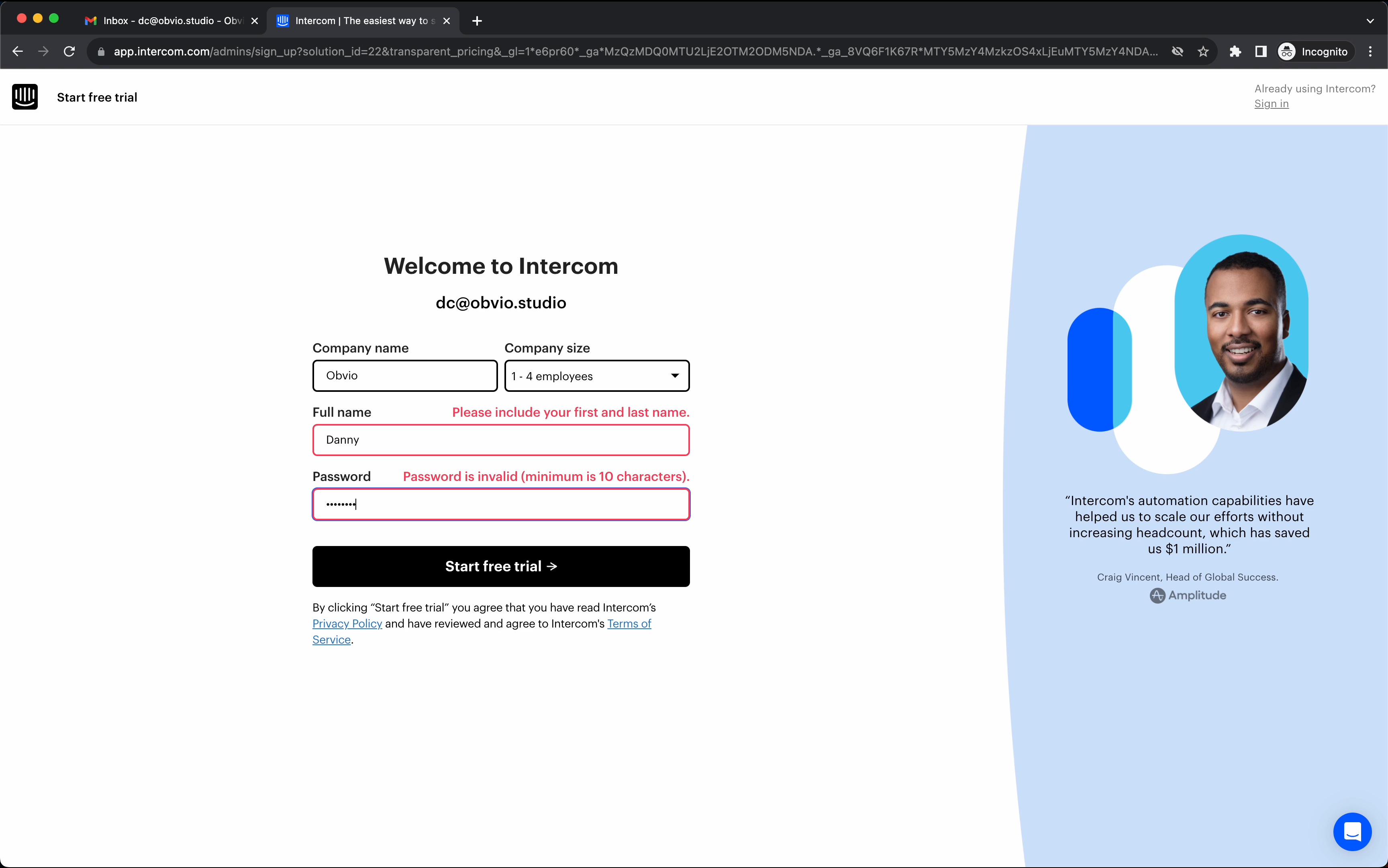
3/ Error inline on the right-hand side of the label is an interesting placement. Typically, I would see it right below the input field. But this works nicely, too.
It probably helps reduce screen jank (inputs shifting up and down because of errors).
4/ Nice touch here by letting you click on an email provider and have it open up.
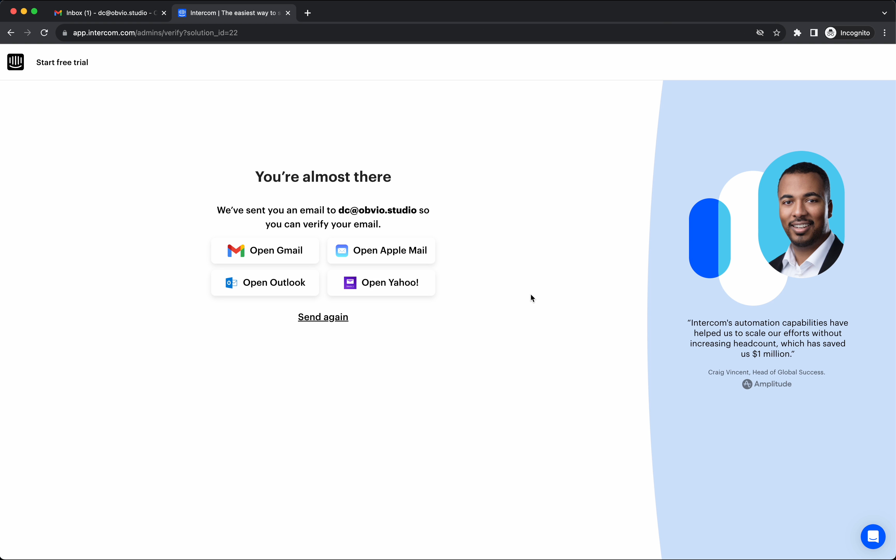
Love how they re-used the primary button as feedback on what’s happening rather than just a simple spinner. Don’t get me wrong. A simple spinner gets the job done, too.
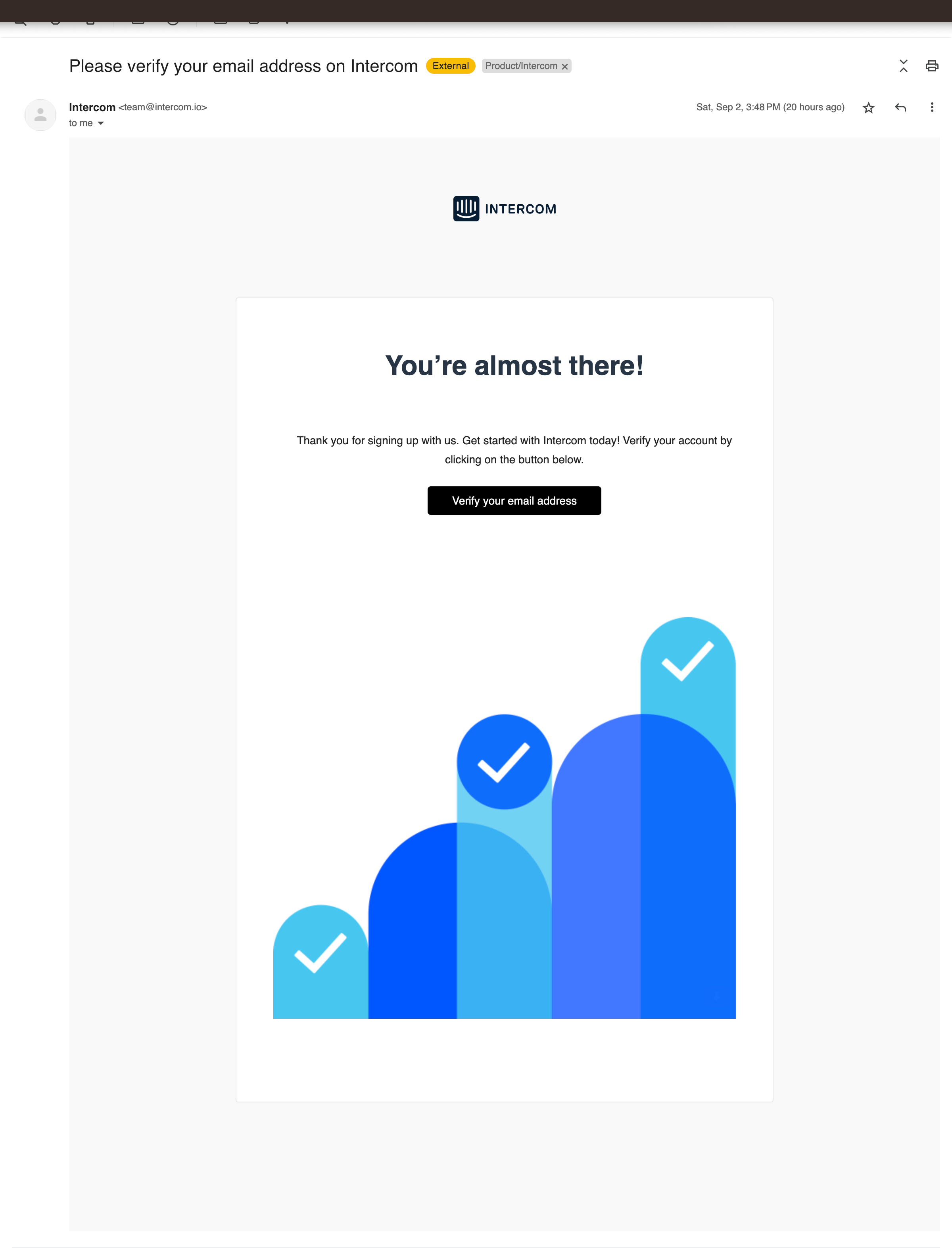
Simple, to-the-point email. No marketing on this one. No upsell. It’s great. The focus here is to get you in the app ASAP.
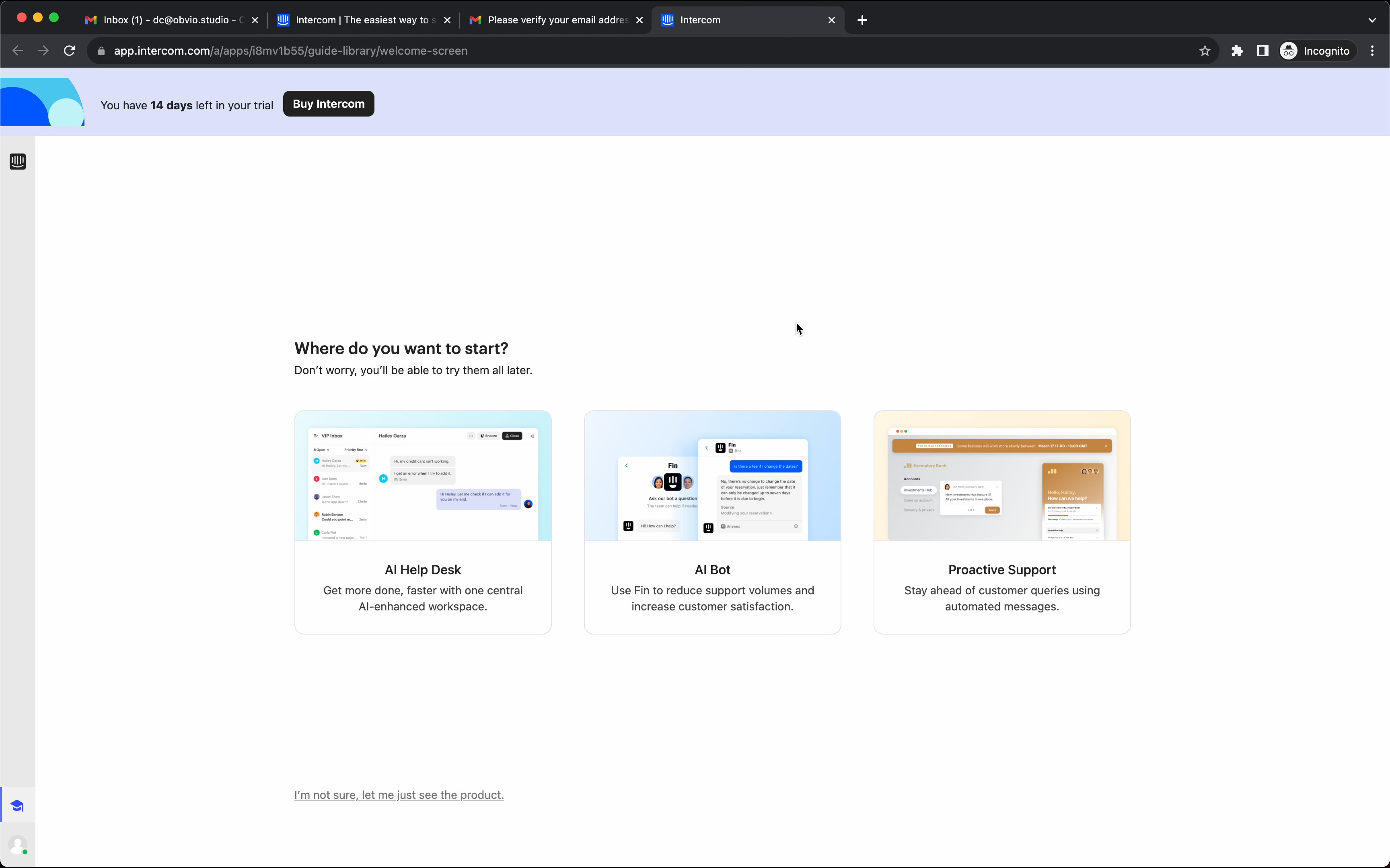
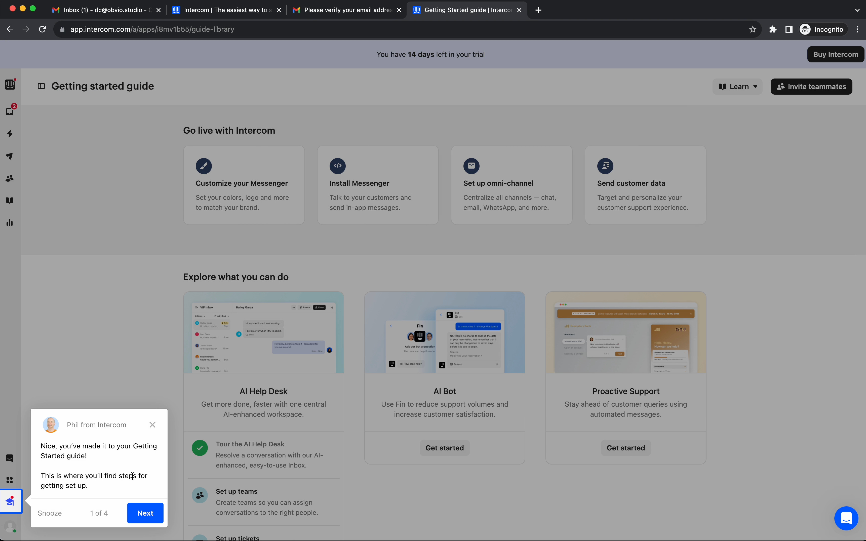
5/ Three clear workflows (with short concise blurbs). While still giving you an out → “I’m not sure, let me just see the product.”
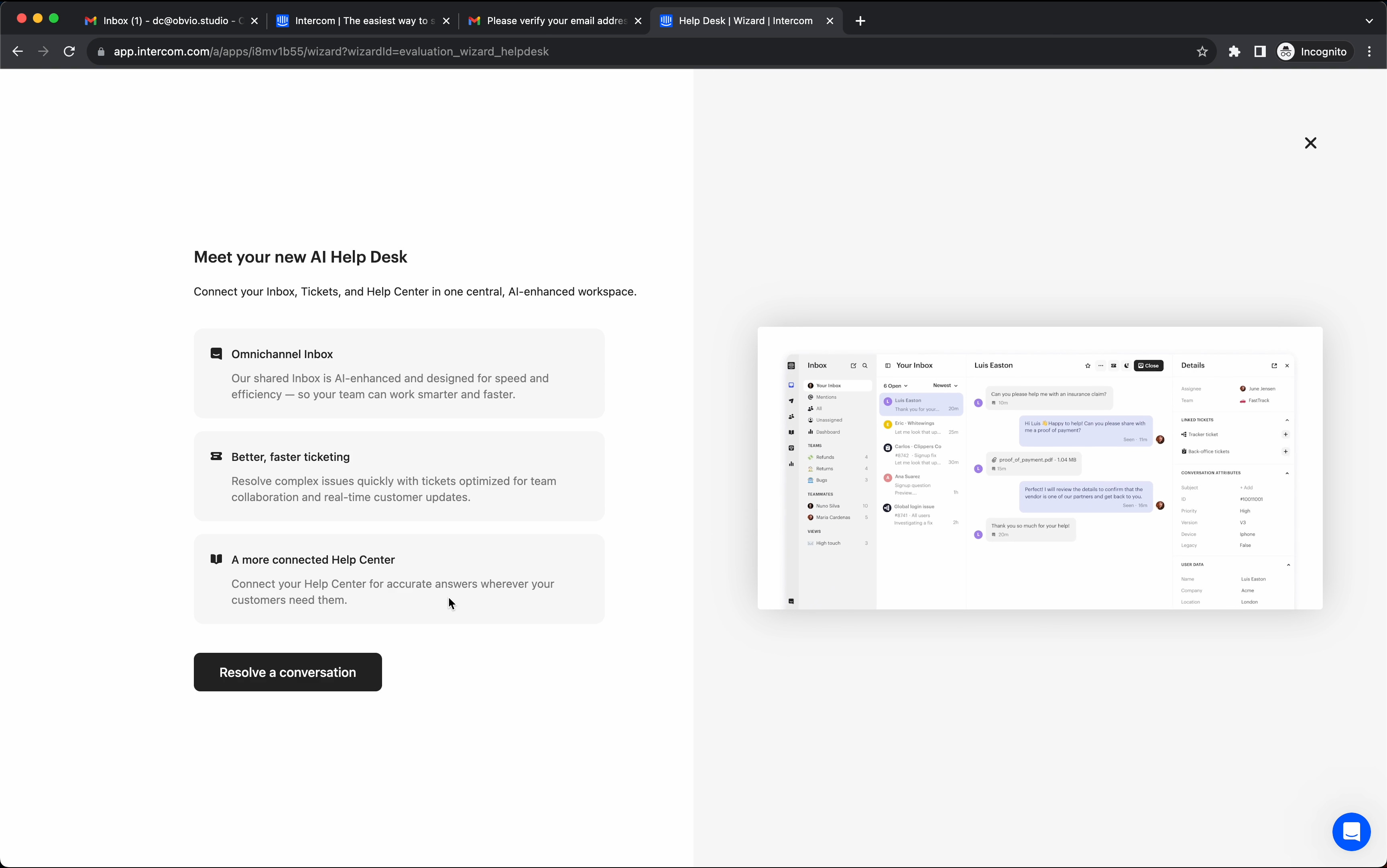
6/ They're giving you an interactive walkthrough demo with a fake user case.
Versus just giving you a few educational callouts. It's a nice touch.
I also love that they're using a gif of the feature in action vs. a static image on the right side.
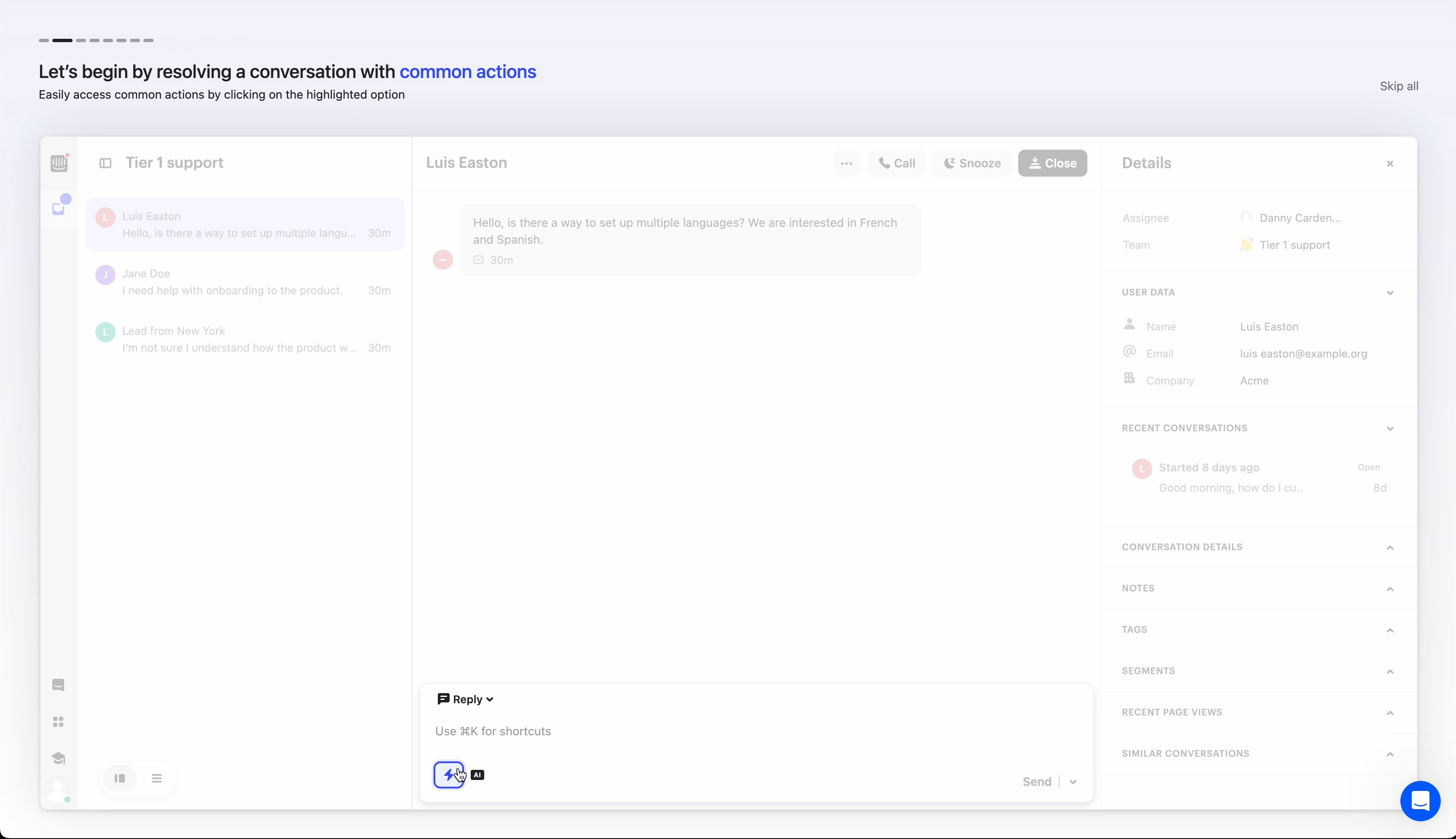
Great move to make the primary button a use case action, "Resolve a conversation," vs. a generic "Next." It helps paint a better picture of what you are about to do.
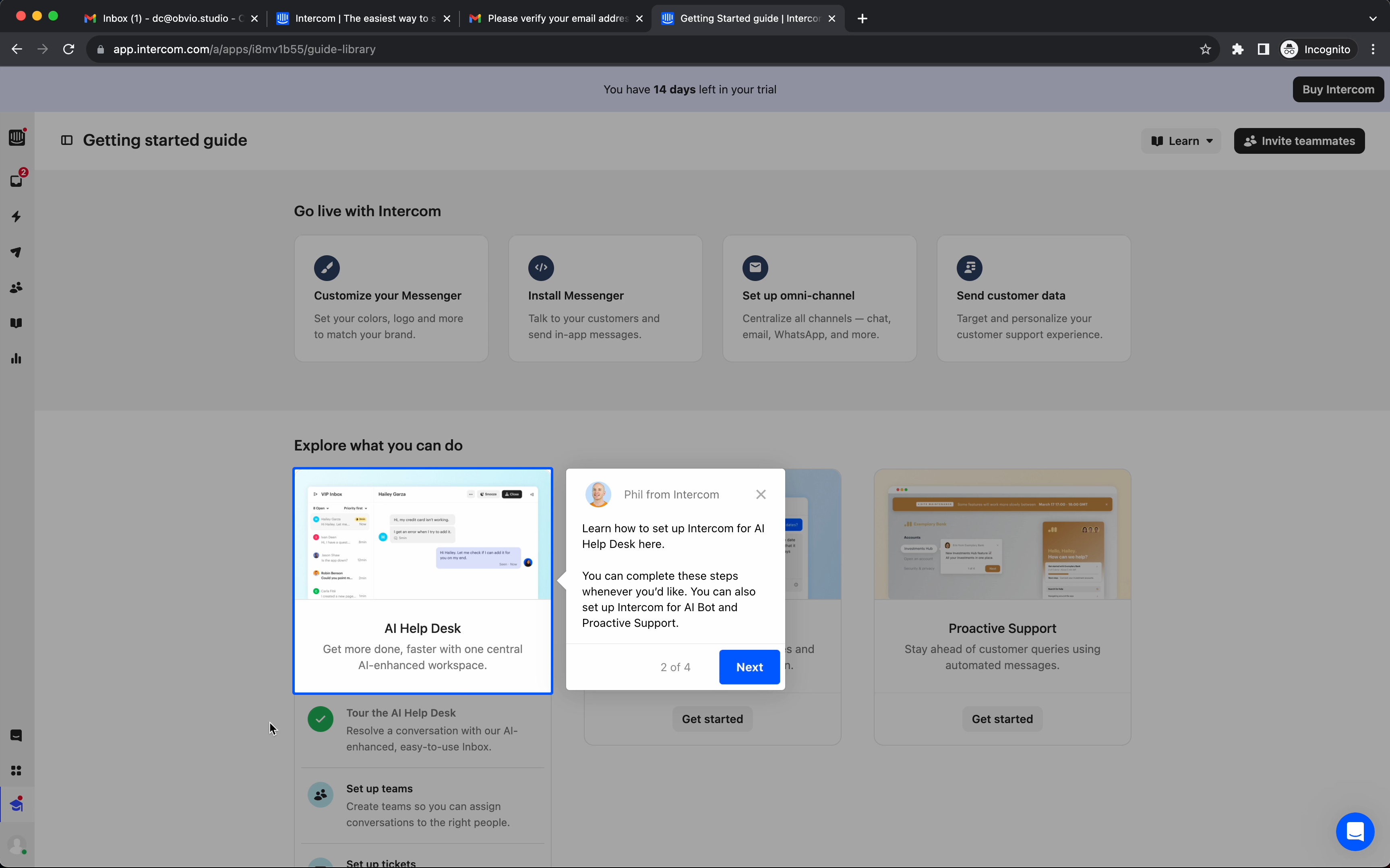
7/ Subtle progress indicator with some more context right underneath. The pulsing highlight on the action you need to take next is a great little detail. They’re pretty much saying, ‘hey, there’s a lot going on here, don’t worry, just focus on this button over here.’
The rest of the steps have similar interactions.
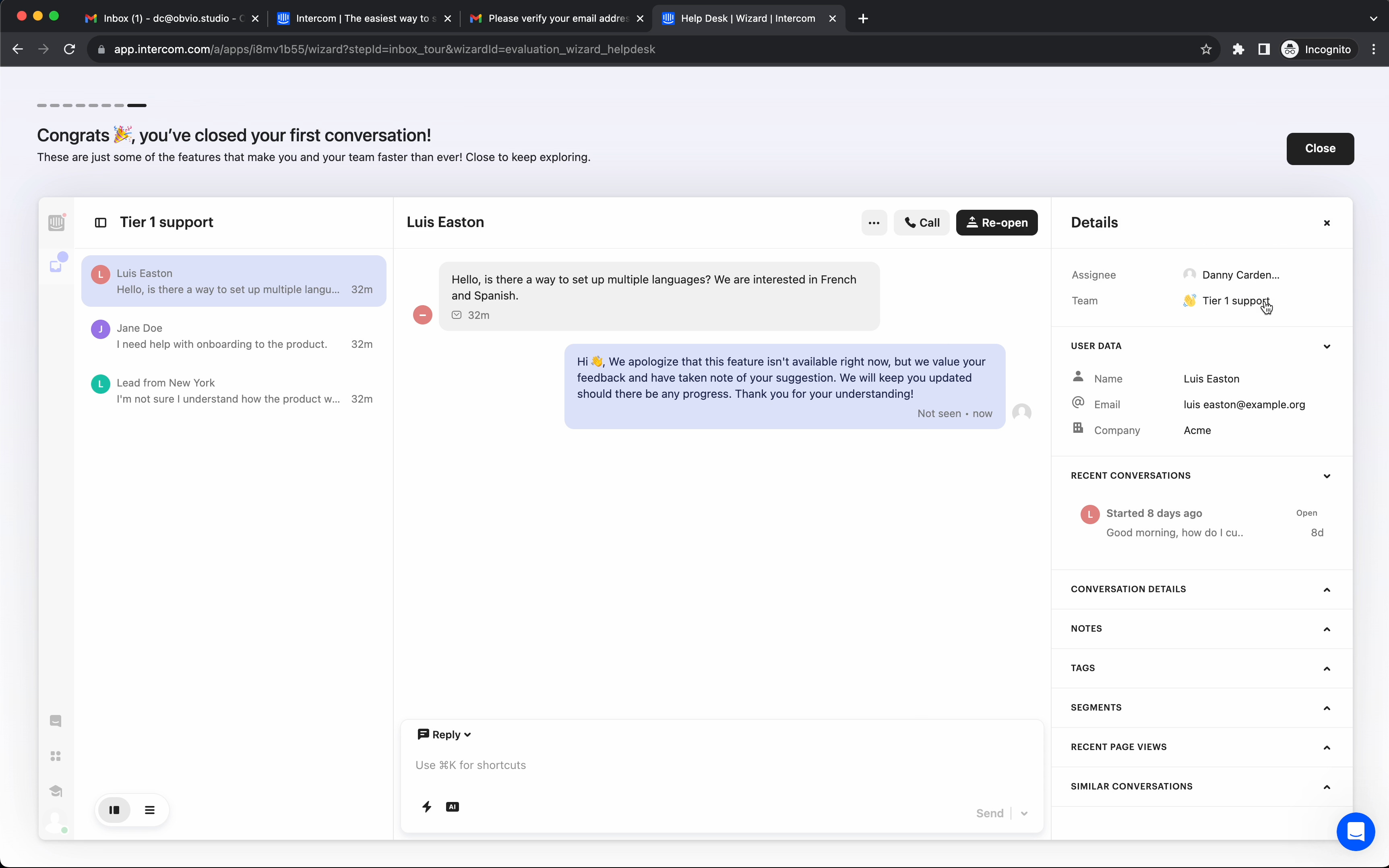
8/ Now, we get more of an educational callout. Notice there’s no back button on these steps. Interesting choice.
My guess, its because it’s short, just 4 simple steps. No need to complicate (both from a user experience and development perspective) with a back button.
Also, notice the ‘Next’ button has a subtle pulsing animation. Another nice touch to keep your attention on the steps (rather than just dismissing them). Pulse animation goes away on the final step for ‘Done.’
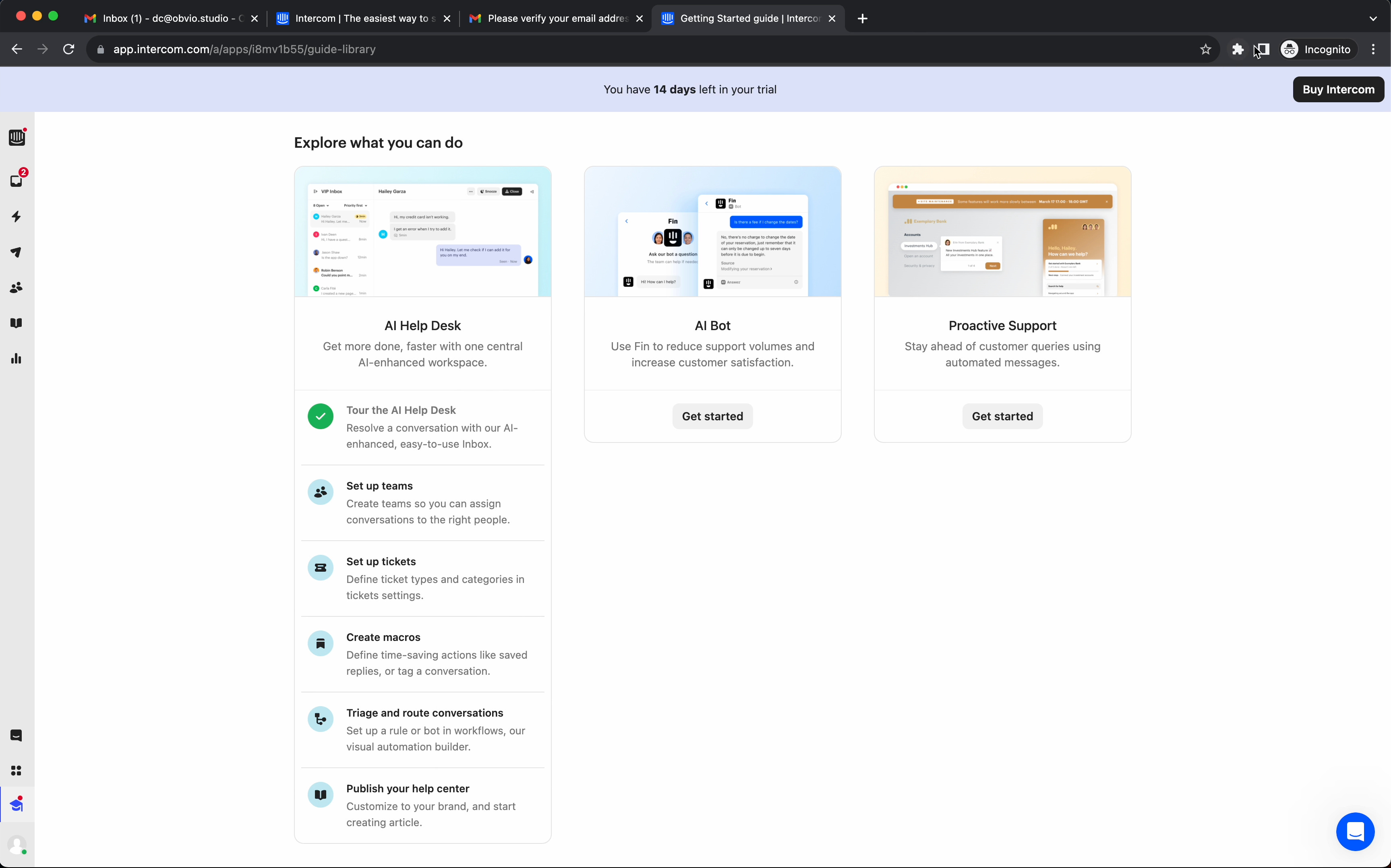
9/ Notice you’re taken back to those 3 original workflows, with an indicator (list of steps) that you just started the first workflow and completed one of the steps (green checkmark).
Unlimited user flow and dashboard designs for your SaaS product. By a senior product designer. One subscription.
Access fast, reliable, high-quality user flow and dashboard designs for your SaaS product with no contracts or expensive retainers.
All for an affordable monthly subscription.
Cancel anytime.