


Intercom-Educational callouts
Let’s breakdown Intercom’s educational callouts. Video, screenshots, and Figma files included.
I’ll hit in a few key details but won’t include all screenshots (take a look at the video for the full flow).
For the sake of time and moving fast, we’re using Untitled UI Design System. I highly recommend it.
Video
Screenshots
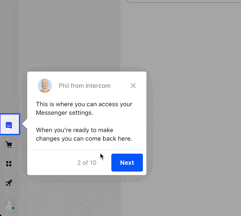
1/ They have a dedicated ‘Getting started’ section where you can demo the product with educational callouts. You’re able to access it whenever, without disrupting your daily workflow.

2/ Love the button's bounce effect. It clarifies there's nothing else to click. The highlighted border around the icon is a great indicator too.
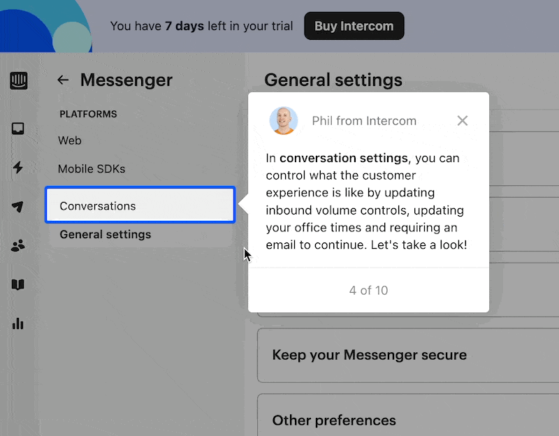
3/ No 'next' button here. The feature itself pulses, signaling a click. This is because they’re taking you to another section of the UI—signaling a new workflow. Nice little detail.
Overall theme here…
A 'Getting Started' section for product demos, accessible anytime without interruption
Buttons have a bounce effect, emphasizing focus. Highlighted borders guide users.
Instead of a 'next' button, the highlighted pulsing border indicates a transition to a new UI workflow.
What's the tradeoff here? While a separate demo section is neat, it might be overkill for a smaller SaaS team. Sometimes, a single educational callout during onboarding does the trick.
Unlimited user flow and dashboard designs for your SaaS product.
By a senior product designer. One subscription.
Access fast, reliable, high-quality user flow and dashboard designs for your SaaS product with no contracts or expensive retainers.
All for an affordable monthly subscription.
Cancel anytime.