Intercom-Analytics
Breaking down intercom’s analytics dashboard. Screenshots, and Figma files included.
For the sake of time and moving fast, we’re using Untitled UI Design System. I highly recommend it.
Screenshots
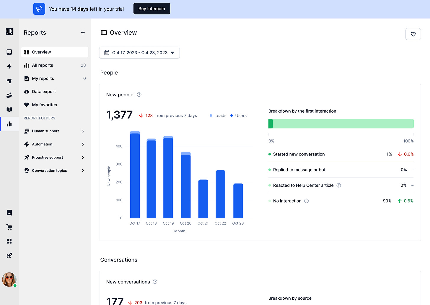
1/ Key stats like 'New people' and 'New conversations' are right up top – easy to spot.
Bar graphs are used to visualize data trends over time, allowing for quick comparisons.
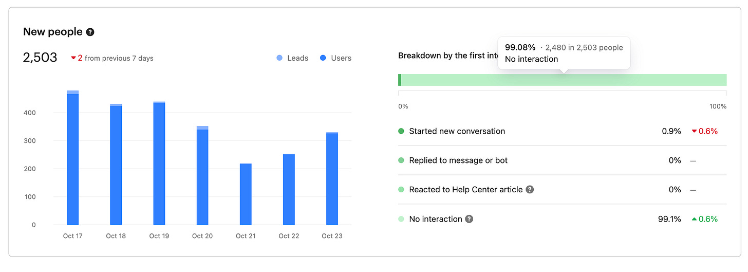
Data is broken down by various categories (e.g. "Breakdown by the first interaction," "Breakdown by source"), giving you deeper insights into the metrics.
2/ All navigation takes place in the left-hand sidebar, keeping the main content area clean and focused.
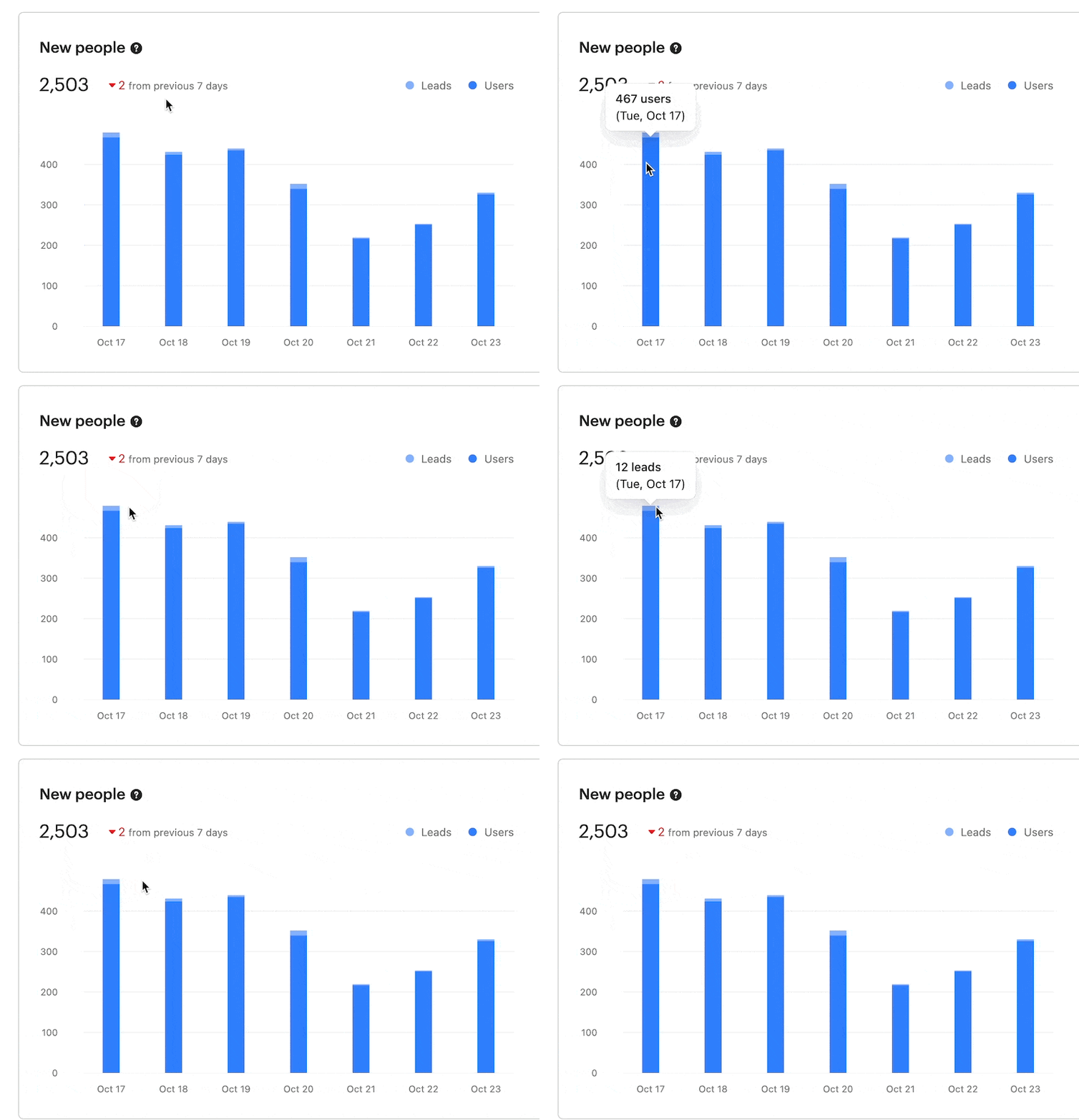
3/ Hover-over tooltips on the graphs and charts provide more detailed information about specific data points.
4/ Whenever possible, an empty state should guide, not halt. Show folks the next move, not a dead end. E.g. how can I get data to display here.
This is just a sliver of all the different analytics Intercom displays. We’ll cover more in other posts.
Unlimited user flow and dashboard designs for your SaaS product. By a senior product designer. One subscription.
Access fast, reliable, high-quality user flow and dashboard designs for your SaaS product with no contracts or expensive retainers.
All for an affordable monthly subscription.
Cancel anytime.


